Designing for a World Where People Have Already Googled Everything Before Walking In
Design spaces for informed customers who research online first, using clear layouts, engaging displays, and smart details that enhance in person experiences.

People walk into a store, open an app, or land on your website already knowing a lot. They have read the reviews, compared the prices, watched a few YouTube videos, and maybe even skimmed a Reddit thread about your product. By the time they reach you, they are not starting from zero. They are somewhere in the middle of a decision. Designing without accounting for this shift is one of the most common mistakes teams make today.
Your Users Arrive Already Mid-Journey
There was a time when brands controlled the information flow. You walked into a dealership not knowing much, and the salesperson guided you. That dynamic has flipped completely. Now, the person sitting across from you or landing on your homepage has often done more research than your own support team.
This changes what good design means. You are no longer designing for someone who needs to be educated from scratch. You are designing for someone who needs confirmation, clarity, and a smooth path to action. Treating them like a beginner creates friction. It slows them down and, worse, it signals that you don't understand them.
Good design in this environment starts with one honest question: what does someone already know when they arrive here, and what are they still not sure about? Answering that question should drive every layout decision, every content choice, and every interaction you build.
Ditch the Basics: Get to the Good Stuff
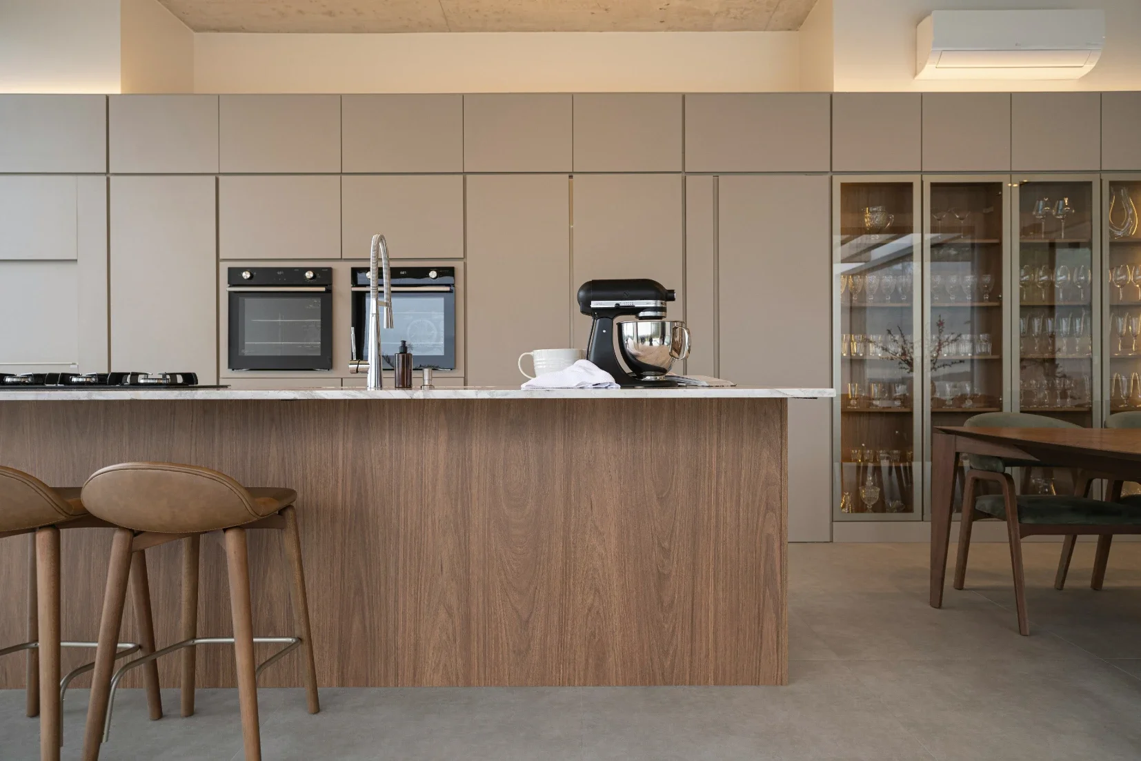
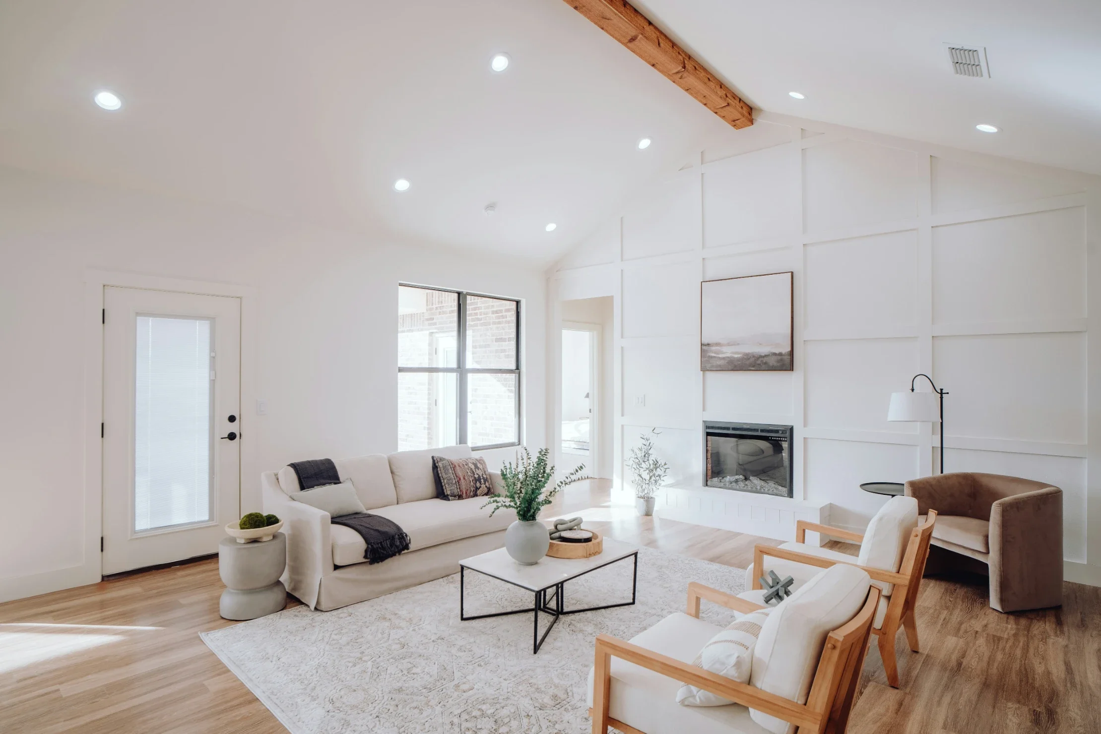
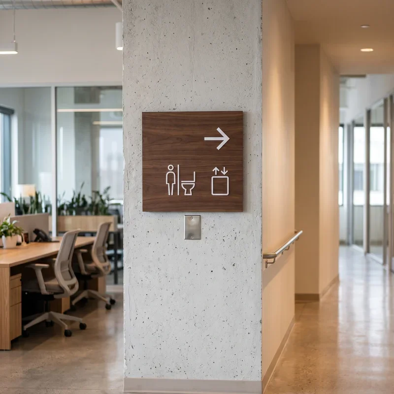
Erin Morris, a retail space designer, often highlights what they calls entry-point empathy. It’s about understanding a shopper’s mindset the moment they step into a space, not just what they came to buy, but how they feel, what catches their attention, and what might overwhelm or guide them. It’s a subtle shift in thinking, but one that makes a bigger difference than most teams expect.
When someone already knows the basics, walking them through those basics again creates a kind of invisible wall. They feel unseen. They start wondering if this product is even for them. The drop-off that happens in those first few seconds is rarely about the visual design. It's about a mismatch in assumed knowledge.
Skip the tutorial for users who didn't ask for one. Assume competence by default, and build opt-in help for those who want it.
What Friction Actually Looks Like Now
Old friction was things like slow load times, confusing navigation, or ugly interfaces. Those still matter, but there is a newer kind of friction that is harder to spot: redundant context. When your homepage explains what a password manager does to a person who just Googled “Best password manager 2025”, you've already lost them in the first paragraph.
Friction today looks like over-explaining. It looks like putting product education before product access. It's the five-step onboarding flow when the user just wants to import their data and get started. It's the FAQ that answers questions nobody is actually asking anymore because those questions got answered on Google six months ago.
Designing Around the Knowledge Gap, Not the Product
Here is a shift that changes everything: design around what users don't know yet, not around what your product does. Most design teams spend enormous energy showcasing features. Research-savvy users already know the features. What they need help with is the specific situation that applies to them.
Think about it this way. A user landing on a project management tool's website has probably already compared you to three competitors. They are not asking What is project management software? They are asking, Will this work for a remote team of 12, where half the people are non-technical? Design for that question, and you win. Design for the general case, and you become forgettable.
This is where segmentation in design gets really powerful. Entry points tailored by use case, a landing page for agencies, another for solo freelancers, another for enterprise teams. Let users self-select into a path that speaks to their specific context. They don't have to sift through information meant for someone else.
Trust Signals Have Shifted Too
When people arrive already informed, generic social proof no longer lands the same way. Saying, trusted by thousands of customers means very little to someone who has already read fifteen G2 reviews and three case studies. They are past that stage.
The trust signals that work now are more specific and more honest. Real numbers from real use cases. Named customers with actual outcomes. Transparent pricing without contacting us for an enterprise dead end. Side-by-side comparisons that acknowledge your weaknesses because your visitor has already read about them anyway.
Being honest about what you are not great at, inside your own design, is a counterintuitive move that builds more trust than any badge or logo wall. It shows you understand your audience. It shows you know they have done their homework.
Micro-Moments Are Where Decisions Actually Happen
Google introduced the idea of micro-moments years ago. Those short windows where someone reaches for their phone to know, go, do, or buy something. Designing for a post-Google world means recognizing that your product might be the final step in a long chain of micro-moments. Your design doesn't need to kick off that chain. It needs to close it gracefully.
That means your calls to action need to match the decision stage. A productive setup ensures everything flows with intent. Learn more is for someone early in research, start your free trial is for someone who already knows they want to try, and talking to a real person is for someone who has done everything except make peace with the commitment. If you offer the wrong CTA at the wrong moment, you don’t just lose a conversion. You lose the trust that the user brought to you.
Practical Ways to Build for the Already-Informed
Some reliable patterns work well here. Progressive disclosure, showing just what's needed and letting users dig deeper on their own terms, respects existing knowledge while still supporting those who need more. Search-forward interfaces that prioritize getting to answers fast are almost always better than guided tours for returning or informed visitors.
Personalization based on referral source is underused. If someone arrives from a specific comparison article or a particular search term, you know something about where they are in their decision journey. Use that. Show them the right version of your product, not the generic homepage.
Testing is the only way to know if your assumptions about user knowledge are accurate. Talk to people right after they arrive. Ask what they already knew. Ask what surprised them. The gap between what you think people know and what they actually know is often the exact place where your design is failing.
Designing for the already-informed user isn't about dumbing things down or skipping important context. It's about reading the room. The most effective products right now feel like they already know who you are and where you came from because the design was built around that reality from the very start.
Stay up to date with our latest ideas!