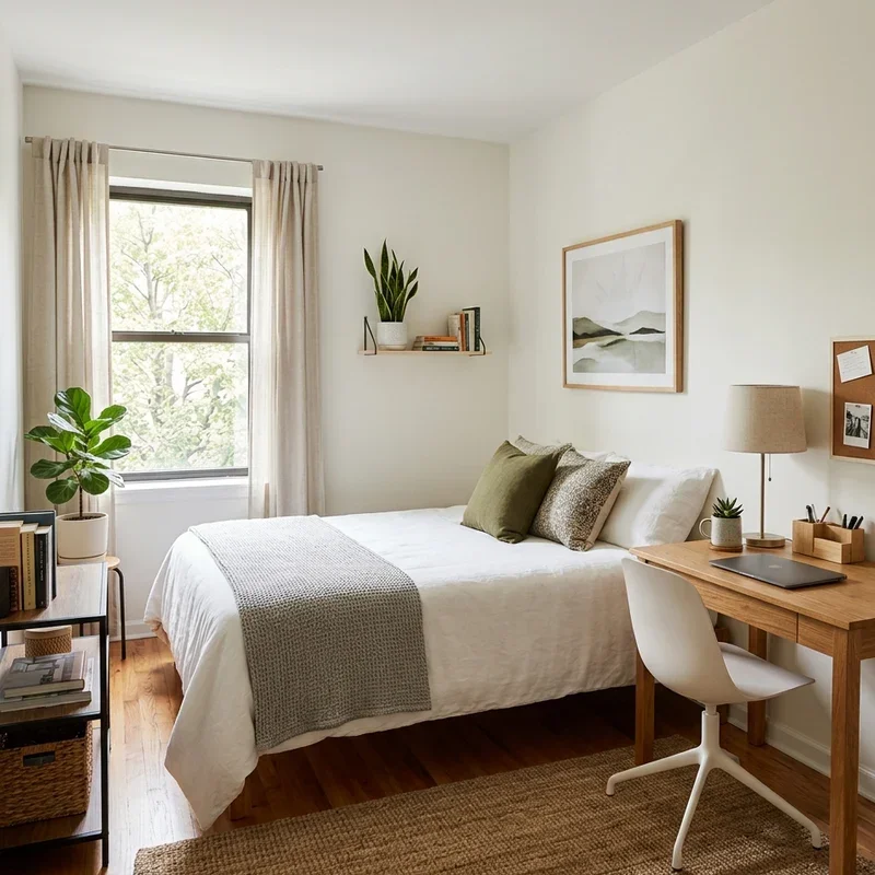
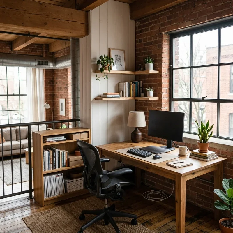
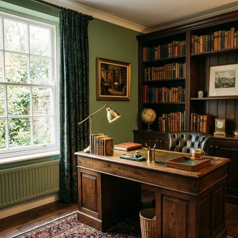
15 Home Office Wall Color Ideas for Productive Spaces
Discover 15 home office wall color ideas for productive spaces that enhance focus, creativity, and daily work performance.
A home office wall color silently influences your productivity, mood, and creative energy every single working hour without you consciously noticing its persistent psychological effect on the quality of focus, motivation, and mental stamina your brain delivers throughout demanding professional days spent surrounded by whatever shade currently covers the surfaces framing your workspace from every visible direction. Have you ever painted a room and immediately felt the atmosphere shift as though the new color physically changed the air temperature, energy level, and emotional character of the entire space without moving a single piece of furniture? That invisible atmospheric power explains why color psychologists insist that wall color ranks among the most impactful design decisions any home office worker makes regarding their daily productive performance. Think of your office wall color as the background music your eyes hear all day. These fifteen ideas compose that soundtrack perfectly.
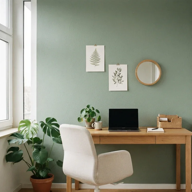
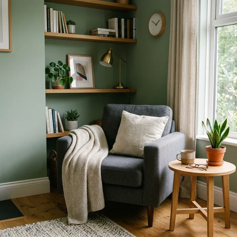
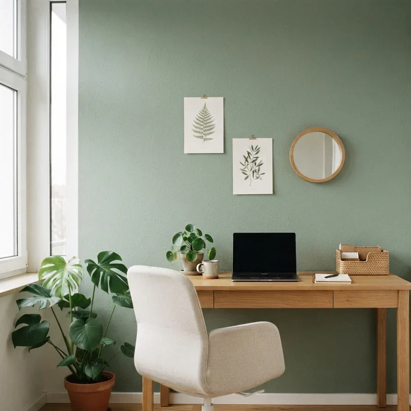
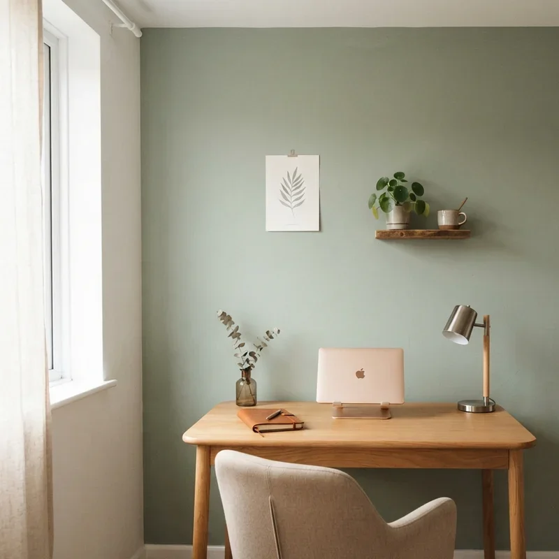
1. Sage Green Calming Focus Color
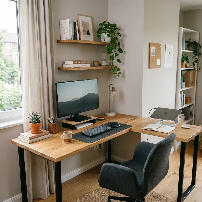
Sage green wraps your home office in the gentle, muted green tones found in herb gardens and misty forests, the naturally calming hue reducing eye strain during extended screen sessions while promoting the sustained concentration that demanding professional tasks require throughout long working days where mental fatigue threatens productive output without the restorative visual relief that green-toned surroundings scientifically provide. Sage green works like painting your walls with concentrated calm that quietly steadies your nervous system throughout every pressured working moment. Select muted sage tones avoiding bright or neon greens that create visual stimulation rather than calming focus. Pair with warm wood furniture enhancing the organic palette.
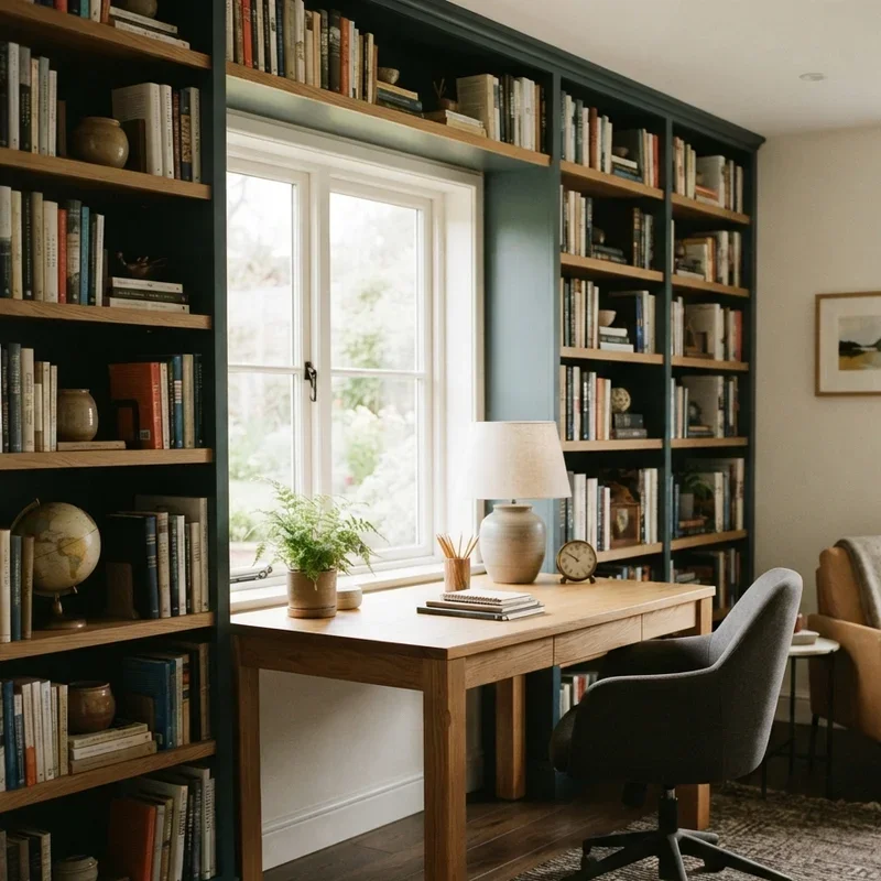
2. Navy Blue Deep Concentration Shade
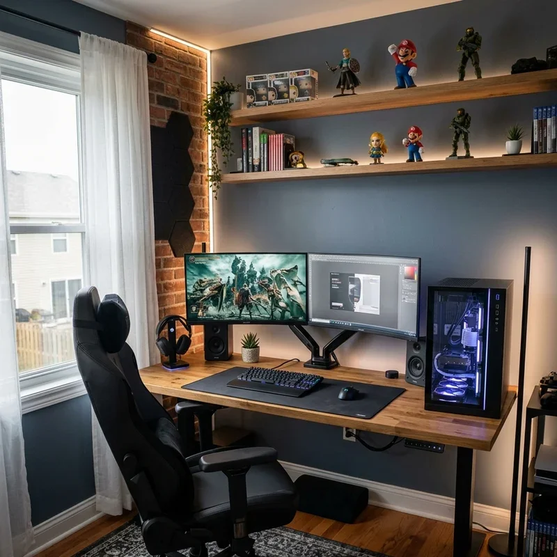
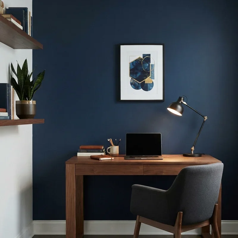
Navy blue creates a deeply focused office atmosphere using the rich, saturated blue tone that color psychology consistently links to enhanced concentration, intellectual stimulation, and trustworthy professional presence throughout workspace environments where serious cognitive effort demands surrounding colors that support sustained mental engagement without distracting through excessive brightness or playful visual energy competing for attention. Navy blue works like painting your walls with liquid concentration where the deep tone tells your brain that serious professional work happens here exclusively. Apply navy to one accent wall preventing the full-room darkness that four navy walls create in smaller office spaces. Pair with white trim and warm brass accents.
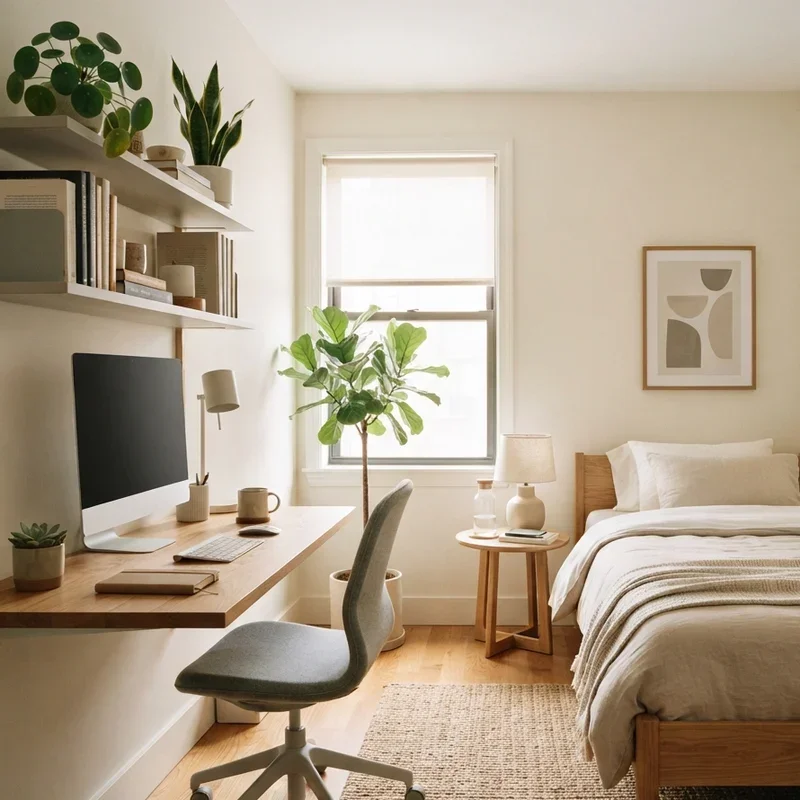
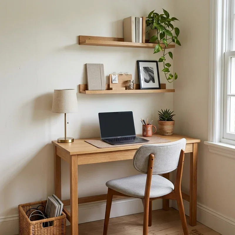
3. Warm White Bright Clean Canvas
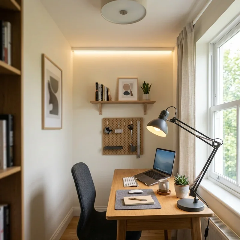
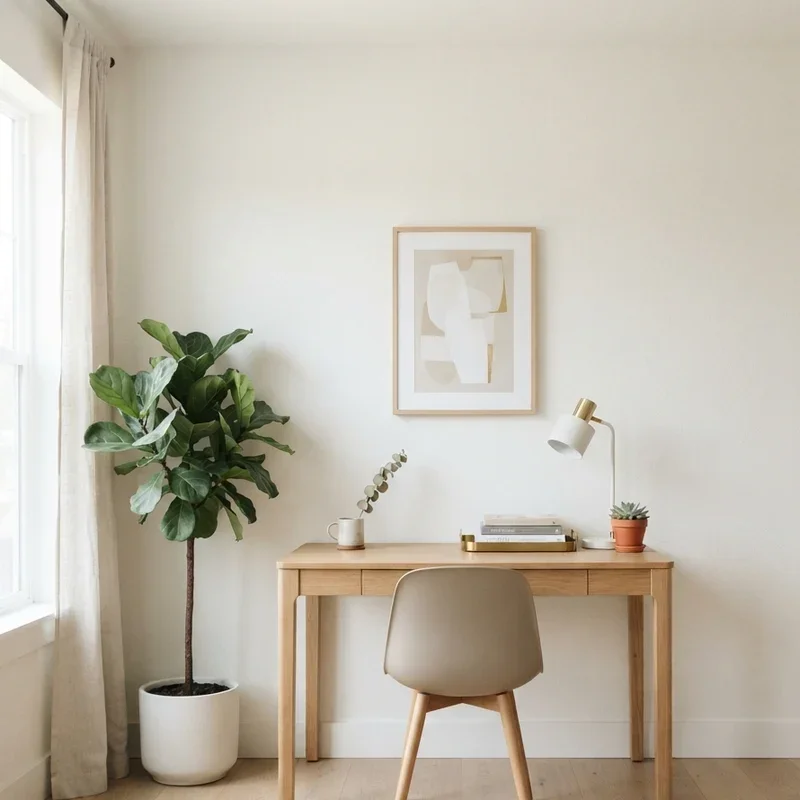
Warm white provides the brightest possible office environment using a clean, light-reflective surface that maximizes natural daylight distribution while the warm undertones prevent the sterile, clinical atmosphere that cool whites impose on workspaces where human comfort and productive warmth must coexist alongside the practical brightness that adequate workspace illumination demands throughout every daytime working session. Warm white works like filling your office with captured sunlight that bounces endlessly between walls creating an expansive brightness from every direction. Select whites with visible warm undertones including soft yellow, peach, or cream bases. Avoid stark cool whites reading clinically in small office environments.
4. Soft Grey Professional Neutral Tone
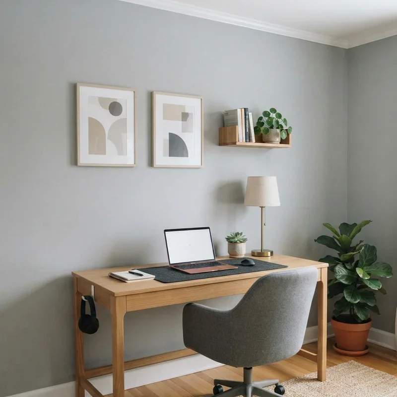
Soft grey establishes a professional, sophisticated office atmosphere using the most versatile neutral available in interior design, the moderate tone providing enough visual weight to feel intentionally designed while remaining sufficiently neutral to support any accent color, furniture style, or decorative direction without chromatic conflict between walls and surrounding workspace elements competing for visual attention. Soft grey works like dressing your office walls in a perfectly tailored neutral suit that coordinates with absolutely everything you place against it effortlessly. Select warm-toned greys with visible taupe or greige undertones preventing cold, depressive atmospheric quality. Pair with warm lighting sources maintaining comfortable visual temperature.
5. Dusty Blue Serene Productivity Color
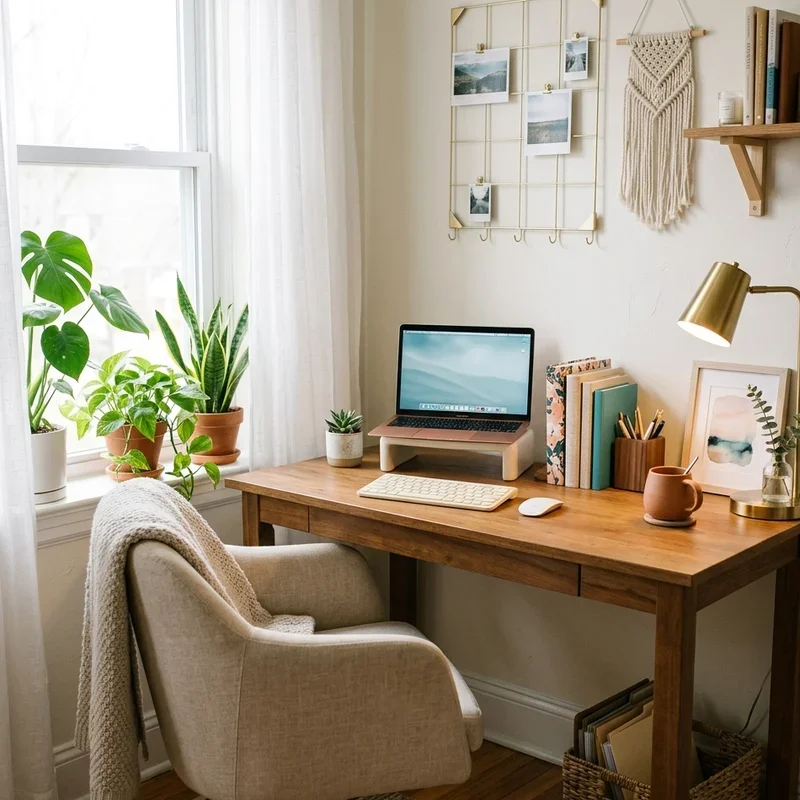
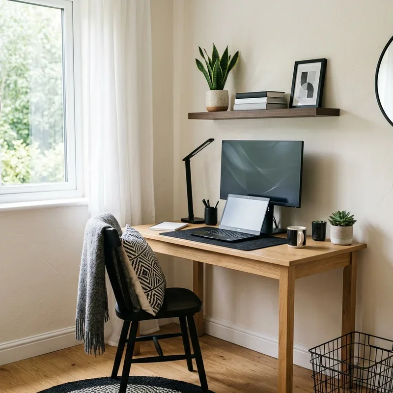
Dusty blue paints your office walls in a softened, muted blue that promotes serene focus through the gentle calmness blue tones naturally provide without the intensity that saturated navy or cobalt blues impose on compact workspace environments where visual subtlety serves productive concentration better than dramatic color statements demanding constant visual processing energy from the working brain throughout the already demanding professional day. Dusty blue works like gazing at a calm sky while working where the gentle overhead tone settles your mind into focused productive rhythm quietly. Select muted, greyed-down blue tones providing subtle color presence without overwhelming intensity. Pair with cream textiles and natural timber furniture.
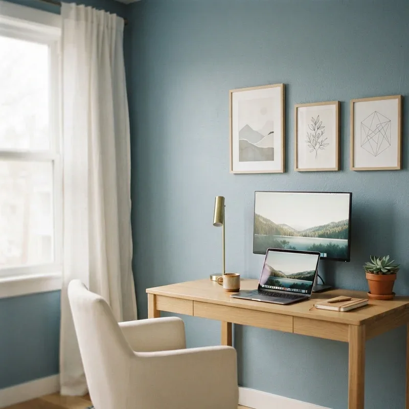
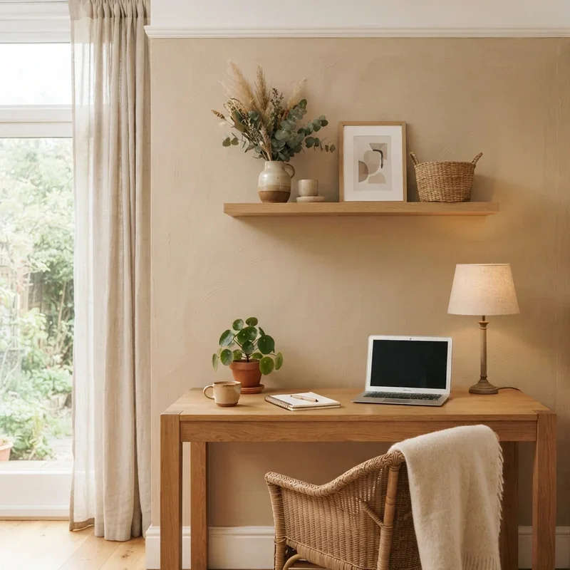
6. Warm Beige Earthy Comfort Shade
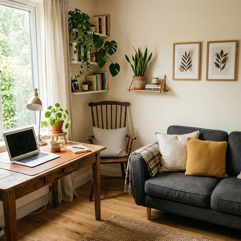
Warm beige surrounds your workspace in earthy, grounded tones that promote comfortable, sustained productivity through the psychologically reassuring warmth that earth-connected colors provide to human nervous systems evolutionarily programmed to associate sandy, soil-like tones with safety, stability, and the grounded calm that adventurous, stimulating colors like red and orange deliberately sacrifice for energizing excitement. Warm beige works like wrapping your office in a visual comfort blanket where the earthy tone tells your brain that this environment feels safe for sustained focused thinking. Select beige with visible golden undertones avoiding cool-leaning sandy shades. Pair with darker wood furniture creating grounded, established atmosphere.
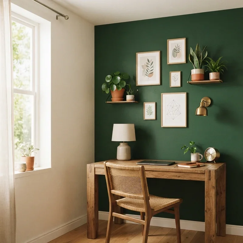
7. Forest Green Bold Creative Accent
Forest green applies a deep, rich green accent wall creating a bold, nature-connected focal surface that stimulates creative thinking through the biophilic response humans experience when surrounded by deep green tones reminiscent of lush forest environments where evolutionary history hardwired relaxation and creative problem-solving responses into the human brain's fundamental operating system permanently. Forest green works like bringing the deepest woodland shade indoors where creative thinking flourishes beneath the canopy-like color overhead and beside you. Apply to one accent wall preventing the cave-like darkness that four forest green walls create within standard office dimensions. Pair with warm white remaining walls.
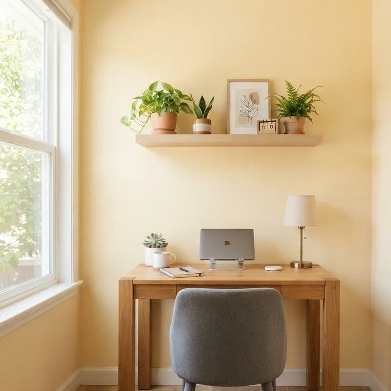
8. Pale Yellow Energizing Optimism Color
Pale yellow infuses your office with gentle warmth and subtle energy using the color most consistently associated with optimism, cheerfulness, and positive mental energy, the soft sunshine tone lifting mood and combating the afternoon energy dips that neutral and cool-toned offices allow to settle unchallenged across the workspace during the productivity-threatening post-lunch hours every working professional dreads daily. Pale yellow works like painting bottled morning sunshine across your walls where the gentle warmth maintains cheerful energy without aggressive intensity. Select very soft, muted yellows avoiding bright or saturated tones creating visual overstimulation rather than gentle energizing warmth. Pair with white trim maintaining fresh, clean presentation.
9. Charcoal Grey Moody Focus Shade
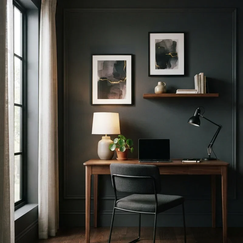
Charcoal grey creates an enveloping, deeply focused office atmosphere using a near-black neutral that minimizes visual distraction by reducing surrounding visual stimulus to near-zero, the dark walls creating a cocoon-like environment where the screen and desk materials command complete attention without colorful walls competing for the visual processing resources your brain needs directed exclusively toward productive work. Charcoal grey works like turning down the visual volume in your office where dark walls let your work become the brightest thing in the room naturally. Apply charcoal selectively avoiding complete room darkening that creates oppressive rather than focused atmospheres. Pair with bright white desk and warm accent lighting.
10. Terracotta Warm Inspiration Color
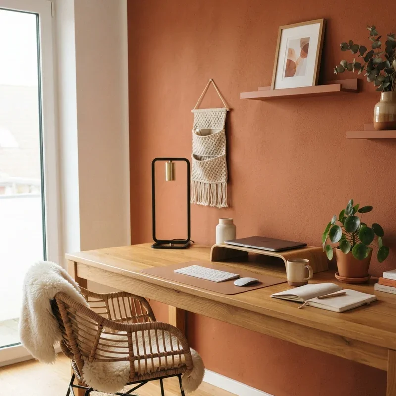
Terracotta paints your office walls in rich, sun-baked clay tones that promote creative inspiration through warmth and earthy energy, the Mediterranean-inspired shade creating an atmosphere reminiscent of artistic studios and cultural creative spaces where the warm, oxidized earth tones have surrounded creative professionals for centuries throughout Mediterranean architecture and artistic tradition worldwide. Terracotta works like bringing a piece of sun-warmed Italian clay into your workspace where the earthy warmth inspires creative thinking naturally from every surrounding surface. Select muted terracotta tones providing warmth without aggressive orange intensity that overwhelms in prolonged exposure. Pair with cream accents and natural timber furniture.
11. Blush Pink Creative Calm Shade
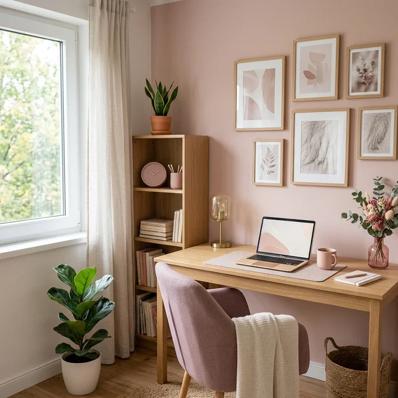
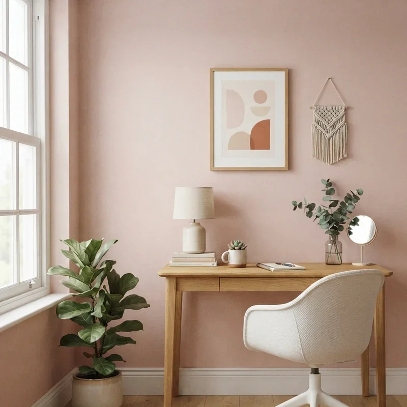
Blush pink introduces a softly creative, calming influence using the gentlest possible pink tone that color psychology links to emotional calm, compassionate thinking, and the relaxed creative state where innovative ideas emerge most freely from minds unburdened by the stress and tension that high-energy, aggressive colors like red and bright orange deliberately trigger through their stimulating wavelength frequencies. Blush pink works like painting your walls with a visual deep breath where the soft tone encourages calm creative thinking without sacrificing professional presentation credibility. Select very subtle blush tones barely distinguishable from warm white maintaining professional office appearance. Pair with grey and brass accents.
12. Teal Blue-Green Dynamic Focus Color
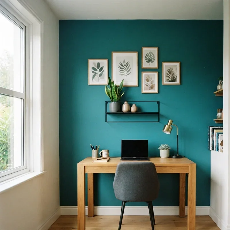
Teal combines blue's concentration-enhancing properties with green's calming restorative benefits creating a dynamic dual-action wall color that simultaneously sharpens focus and reduces stress, the blue-green hybrid delivering the best productivity-supporting qualities of both parent colors within one sophisticated shade that suits creative professionals and analytical workers equally throughout diverse professional task requirements. Teal works like blending the two most productivity-friendly colors into one powerful hybrid that multitasks as effectively as you need to at your desk daily. Select muted teal tones providing sophisticated color presence without overwhelming visual intensity. Apply as an accent wall providing focused color impact alongside neutral remaining surfaces.
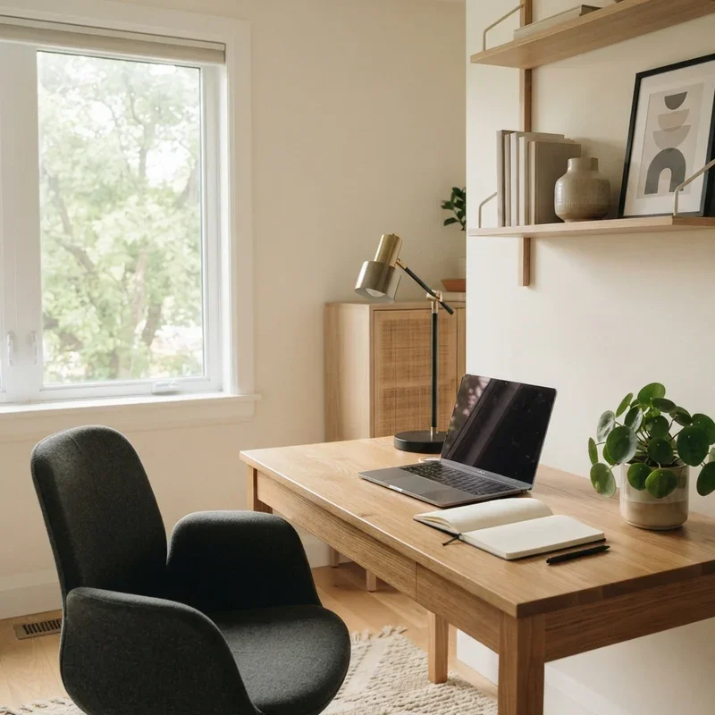
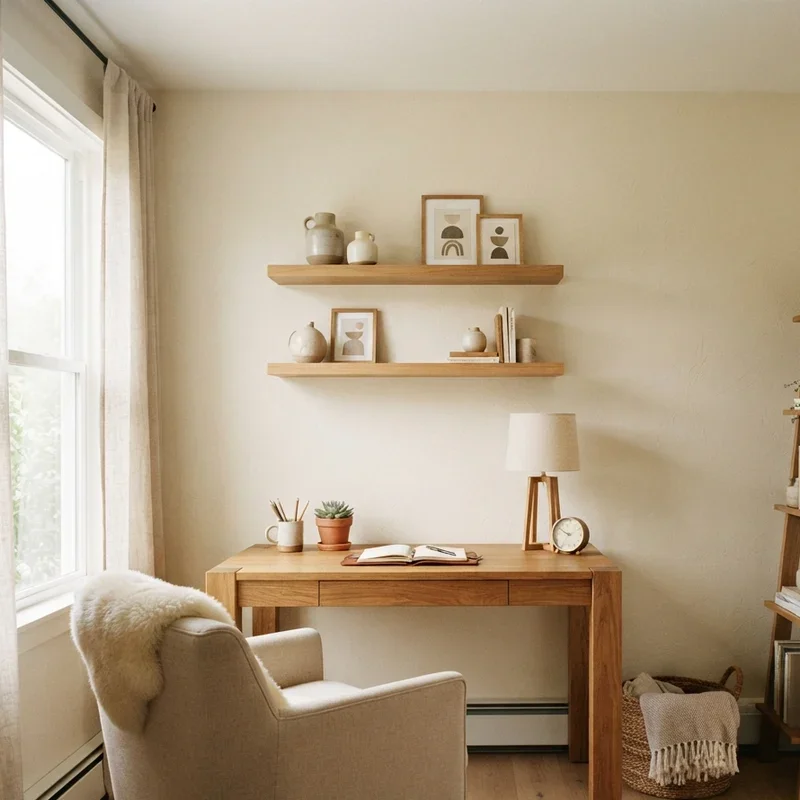
13. Cream Warm Neutral Versatile Shade
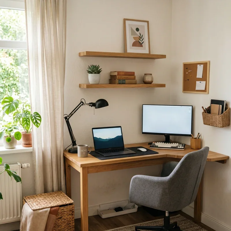
Cream provides the warmest neutral canvas available using a yellow-tinged white that reflects generous natural light while adding the subtle warmth that pure whites and greys permanently lack throughout their cooler temperature presentations, the gentle cream tone creating a versatile foundation supporting every accent color, furniture style, and decorative approach without imposing any specific atmospheric agenda. Cream works like spreading warm butter across your office walls where the gentle golden undertone adds just enough warmth to feel intentionally comfortable rather than accidentally plain. Select cream with visible warm undertones distinguishing it clearly from standard white paint options. Pair with warm wood creating cohesive organic warmth.
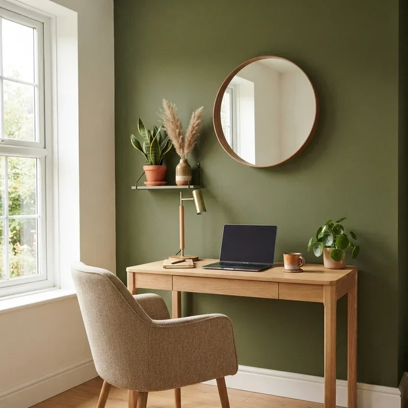
14. Olive Green Natural Grounding Color
Olive green grounds your workspace in the deep, earthy green tone found in Mediterranean landscapes and mature garden foliage, the sophisticated natural shade promoting grounded, sustained focus through its connection to mature natural environments where evolutionary psychology links deep green exposure to stress reduction and restored cognitive capacity throughout extended mental effort periods. Olive green works like painting your walls with the most calming, grounding shade nature produces where mature foliage tones steady your working mind through biological recognition. Select warm olive tones with visible brown undertones providing earthy depth rather than bright acidic green energy. Apply as an accent wall alongside warm neutral remaining surfaces.
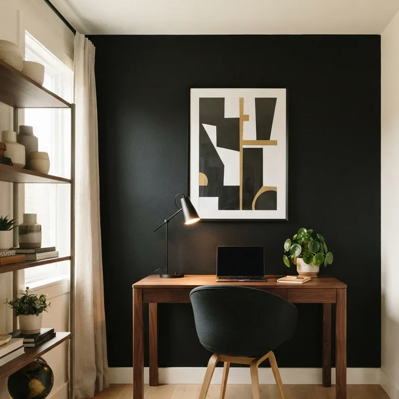
15. Black Accent Wall Bold Statement
A black accent wall creates the most dramatically bold office environment applying complete darkness to one focal surface behind the desk, the absolute color absorption creating a striking backdrop where displayed artwork, shelving, and the workspace itself pop with amplified visual presence against the void-like surface that eliminates all competing visual information from the darkened wall plane entirely. Black accent walls work like hanging a dramatic curtain of visual silence behind your desk where nothing competes with your work for visual attention whatsoever. Apply to one wall only maintaining brightness from remaining light-toned surfaces surrounding the dark focal statement. Add warm lighting preventing oppressive darkness.
Conclusion
Home office wall color ideas prove that the shade covering your workspace surfaces impacts professional productivity, creative energy, and daily work satisfaction far more profoundly than most remote workers realize while spending entire careers surrounded by whatever color the previous resident left behind without considering whether that inherited shade supports or silently sabotages their best professional performance throughout every working hour spent within its persistent psychological influence. From calming sage green to energizing pale yellow and grounding olive, these fifteen ideas demonstrate that wall color genuinely shapes work quality. Choose the shade matching your professional needs and creative personality, then paint your way to better productivity.
Read next: 15 Office Book Shelf Ideas for a Stylish Home Work Space
Frequently Asked Questions
Q1: What wall color scientifically improves focus and concentration in home offices most effectively?
A: Blue tones including navy and dusty blue consistently enhance concentration according to color psychology research.
Q2: Should I paint all four office walls the same color or use an accent wall?
A: Accent walls provide bold color impact while remaining neutral walls maintain brightness and visual balance.
Q3: What wall color works best for creative professionals needing inspiration in home offices?
A: Green tones and warm terracotta promote creative thinking through biophilic and energizing psychological responses.
Q4: Can dark wall colors work in small home offices without making them feel cramped?
A: Yes, one dark accent wall adds depth while light remaining walls maintain spacious perceived dimensions effectively.
Q5: How do I test office wall colors before committing to painting the entire room?
A: Paint large sample swatches observing them across multiple days under both natural and artificial lighting.
Stay up to date with our latest ideas!